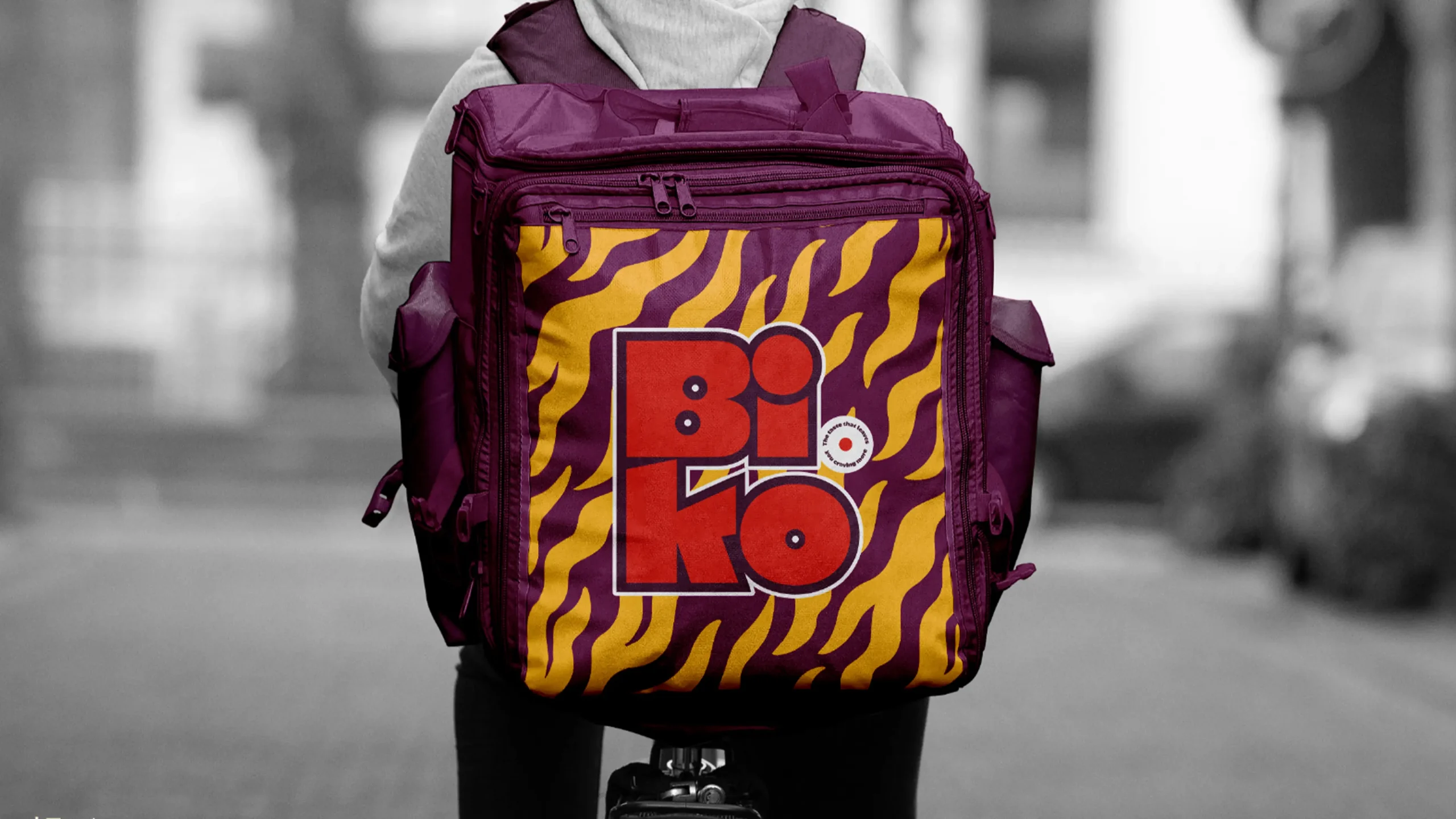
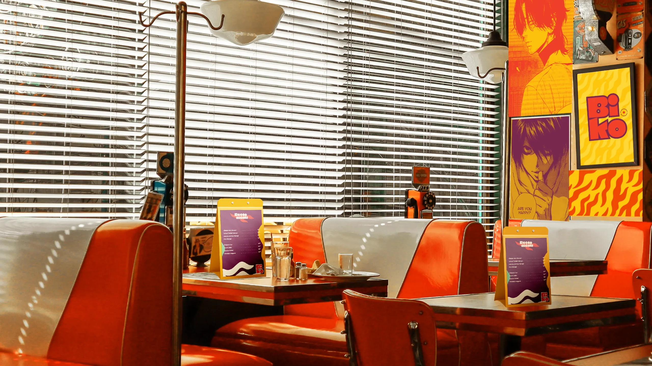
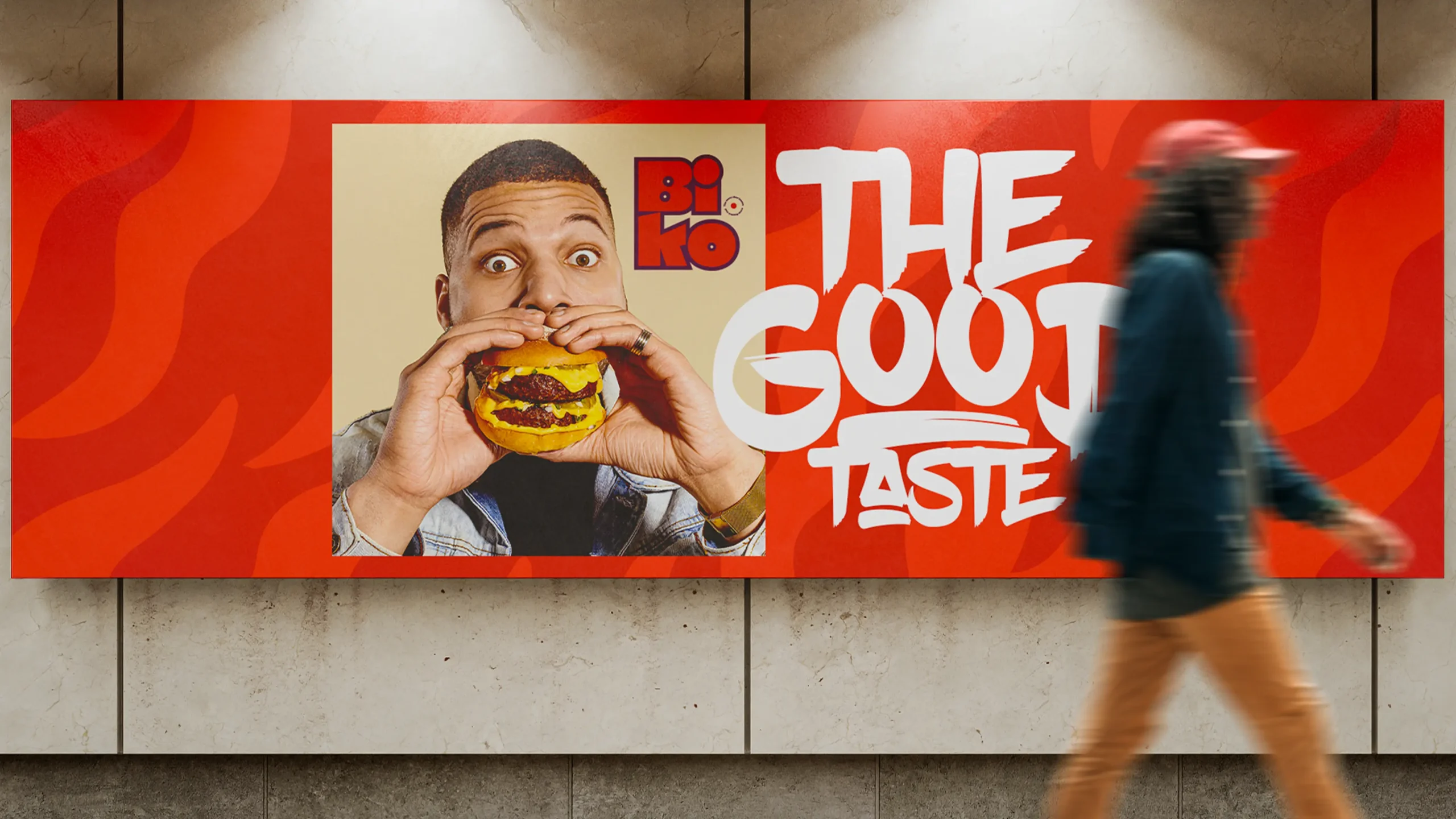
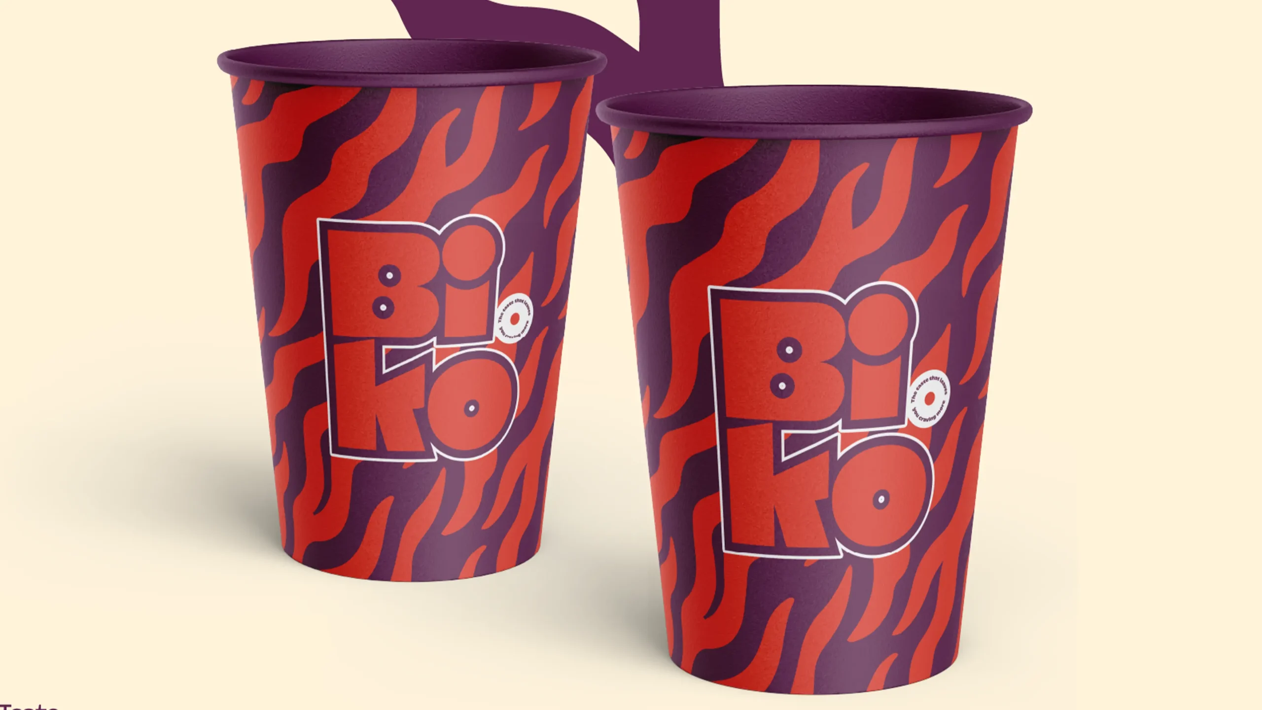
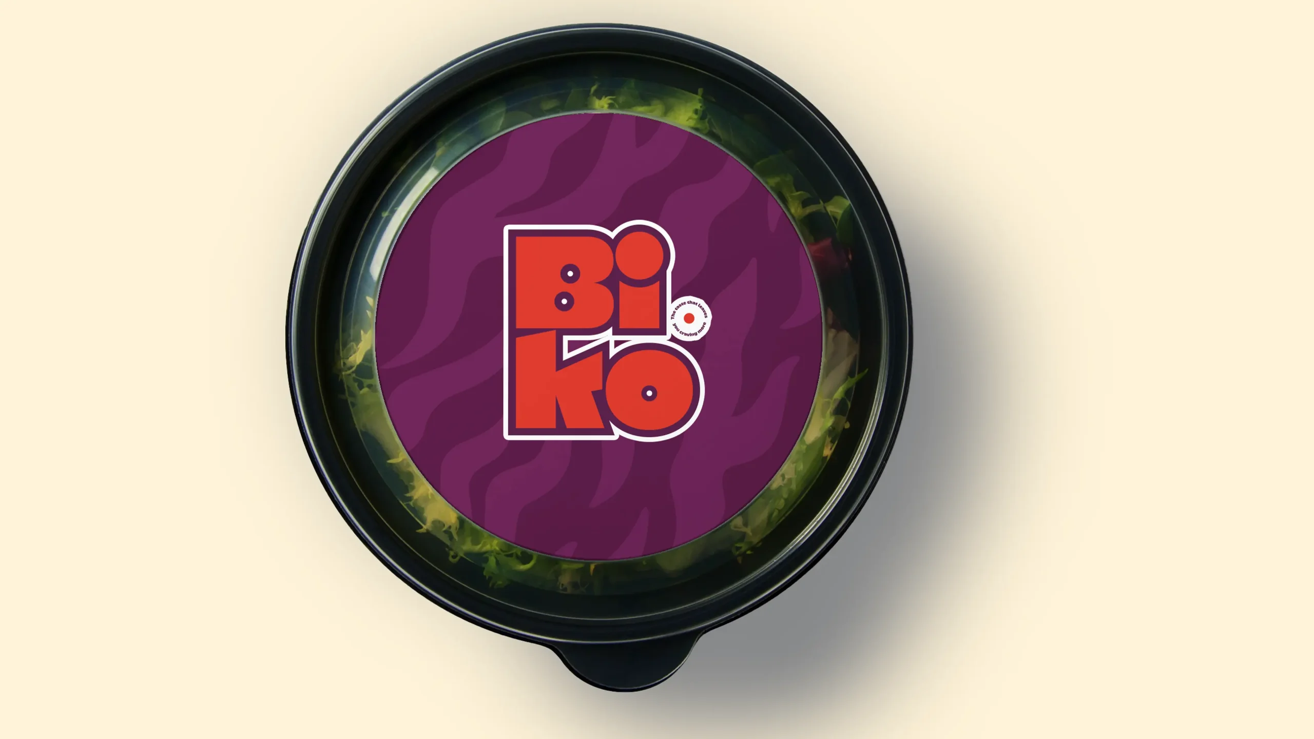
Biko is a high-energy dining destination that celebrates bold flavors and vibrant culture. We developed a visual identity that matches the restaurant's intensity, moving away from traditional "quiet" dining aesthetics to embrace a fearless, multi-sensory brand experience. The result is a loud, unapologetic presence that turns every meal into a visual feast.
Client :
biko
Date :
2025
Services :
Brand Design , Packaging
About Our project
multi-sensory brand experience. The result is a loud, unapologetic presence that turns every meal into a visual feast.
Work
overview
Our
AppRoach
Our approach for Biko focused on maximalist energy and visual rhythm. We moved beyond a simple logo to create a "chaos-contained" system of clashing high-saturation colors and thick, custom typography. By layering bold patterns with a playful, street-inspired graphic language, we built an identity that feels as fast-paced and flavorful as the kitchen itself.